Decisions — visual options
Pick from the pictures. Reply "1: cool, 2: B, 3: simple, 4: blue, 5: CTA-A" or however's fastest.
1Warm footage vs cool world
Keep the founder warm (contrast with the cool product), or grade the footage cool so it's one world?

A — keep warm (current; warm human / cool product)

B — grade cool (one unified cool world)
AI: both Gemini + Codex picked A (keep the contrast).
2L05 — "The vision was right. The infrastructure wasn't."
You said the current card is bad. Three plain-type layouts:
the vision was right.
the infrastructure wasn't.
A — centered, calm, accent on "right"
THE THESIS
the vision was right.
the infrastructure wasn't.
B — lower-left, editorial label
RIGHT.
the infrastructure wasn't.
C — bold split, "right" dominates
AI: both said plain cinematic type, no card (closest to A).
3L15 — "This is Floom."
A — simple mark + wordmark, no loop
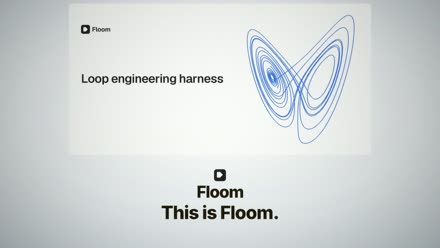
B — keep the loop (current attractor; would be sharpened)
AI split: Gemini → A (clean reveal), Codex → B (the loop is the brand, sharpen it).
4Caption active word — gold or blue
and two months later we're launching
A — gold (current, readable)
and two months later we're launching
B — blue (brand accent)
AI: both preferred blue (fits the cool system).
5Closing CTA — do we end on a "where to go"?
Right now it ends on "Time is life" + the loop. Add a final card?
A — minimal: mark + floom.dev
hire your first agent
floom.dev
B — button: "hire your first agent" + CTA
(no CTA — end on "time is life")
C — no CTA, end on the emotion
AI: Gemini 3.1 Pro → A (premium brands don't beg; a quiet URL sustains emotional resonance while confidently providing the destination without breaking the cinematic spell) · Codex → A (preserves premium restraint while giving viewers the launch destination at the exact moment brand recall is highest)