Decisions — with Gemini + Codex takes
Each question has the frame, the options, and what Gemini & Codex recommend (they're advisory — you decide). Reply "1a, 2a, 3?, 4: L02 a / L03 b…". Say "mock it" for anything you want to see first.
1Core look: warm footage vs cool white
Founder on a warm wood wall; title cards + product UI cool white. Two different worlds.

warm — founder

cool — white synthetic
aKeep the contrast — warm human / cool product.
bGrade footage cooler — one cool world.
cWarm the synthetic toward the wood — one warm world.
dOther.
AI takeboth → a
Gemini: the warm/cool contrast is a core brand tenet, separating the human story from the product world. Codex: the two worlds create the film's central tension; the blue orb bridges them.
Gemini: the warm/cool contrast is a core brand tenet, separating the human story from the product world. Codex: the two worlds create the film's central tension; the blue orb bridges them.
2L05 — "The vision was right. The infrastructure wasn't."

current L05 (you said bad)
aPlain cinematic type on a cool ground, no card.
bMock 2–3 layouts to pick from.
cCut it.
AI takeboth → a
Gemini: the current card feels like a cheap keynote element; clean type direct on the ground is more confident. Codex: plain type turns the line into a verdict, not another product slide.
Gemini: the current card feels like a cheap keynote element; clean type direct on the ground is more confident. Codex: plain type turns the line into a verdict, not another product slide.
3L15 — "This is Floom."

current L15 (attractor loop)
aSimple — plain mark + wordmark, drop the loop.
bKeep the loop, sharper — a signature, not a screensaver.
cOther.
AI takesplit — both say current is too complex
Gemini → a: drop the animation, focus all attention on the mark + name. Codex → b: the loop IS the brand idea — keep it but make it land as a sharp signature.
Gemini → a: drop the animation, focus all attention on the mark + name. Codex → b: the loop IS the brand idea — keep it but make it land as a sharp signature.
4L02 "the dream" + L03 "it broke"
Weak baked-orb b-roll. Concept per beat.
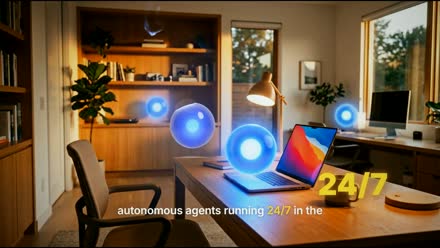
L02 the dream

L03 it broke
aDevices lighting up with agent activity across screens.
bThe orb inside WhatsApp/Telegram threads (working → dying).
cCalm "humming in the background" — orb quietly glowing.
dOther / I'll tell you.
AI takeboth agree
L02 the dream → a (devices lighting up — grounds the agents in tangible results, feels operational). L03 it broke → b (the orb dying inside WhatsApp/Telegram — makes the betrayal specific, personal, product-native).
L02 the dream → a (devices lighting up — grounds the agents in tangible results, feels operational). L03 it broke → b (the orb dying inside WhatsApp/Telegram — makes the betrayal specific, personal, product-native).
5L14 / L16 — type on real footage

L14 drudgery

L16 "time is life"
aApproved — this is right.
bChange — tell me what.
AI takeboth → a
Gemini + Codex: the drudgery→field contrast gives the payoff real emotional scale; don't add explanation, keep it.
Gemini + Codex: the drudgery→field contrast gives the payoff real emotional scale; don't add explanation, keep it.
6Product white cards — design + copy
The white-card mock (white cards, real logos, orb, PIP, animated).
aDesign + copy approved.
bDesign ok, copy needs work — tell me the card text.
cTweak the card style.
AI takesplit on copy
Gemini → a: the style matches a Linear/Vercel-grade premium aesthetic, on-brand. Codex → b: the visual system is right but the copy should get colder, shorter, more command-like.
Gemini → a: the style matches a Linear/Vercel-grade premium aesthetic, on-brand. Codex → b: the visual system is right but the copy should get colder, shorter, more command-like.
7Captions — the yellow active word
You were right — bright yellow was invisible on light grounds. I fixed it to a readable deeper gold-yellow on light (bright yellow stays on dark). Here's the fix:
fixed — "later" now readable
aKeep this gold-yellow (readable, still yellow).
bSwitch the active word to blue (the brand accent) instead of yellow.
cOther — different shade / treatment.
AI takeboth → rework (now done)
Gemini + Codex: bright yellow failed legibility + broke the cool system; both suggested blue emphasis over yellow. You wanted yellow — I made it readable; option b is the AI's preference if you want to consider it.
Gemini + Codex: bright yellow failed legibility + broke the cool system; both suggested blue emphasis over yellow. You wanted yellow — I made it readable; option b is the AI's preference if you want to consider it.